The Brief
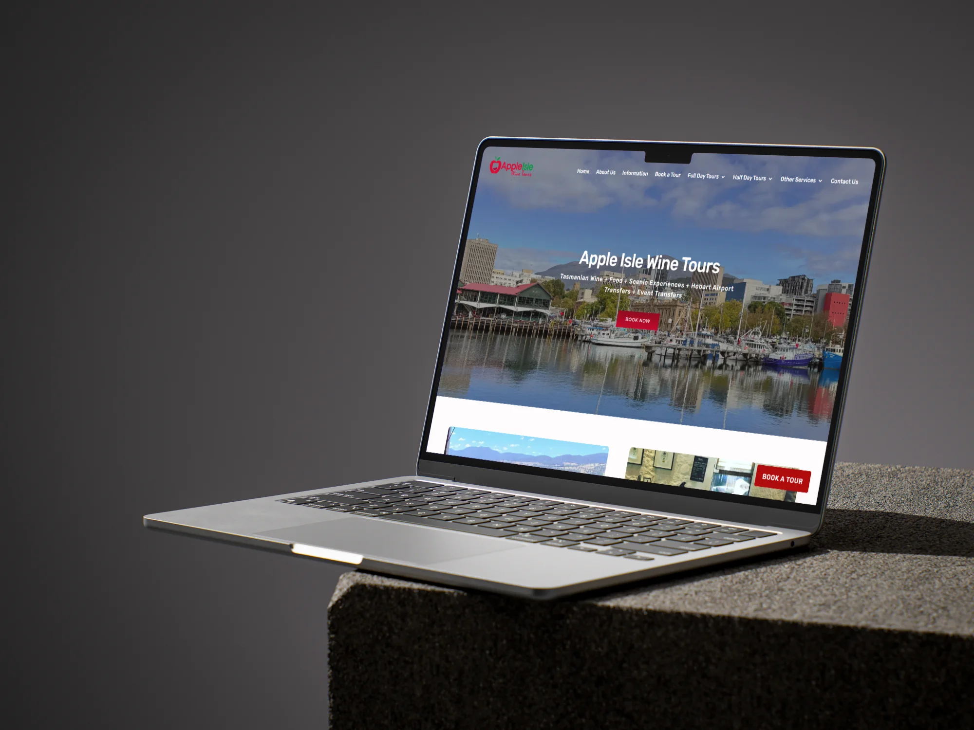
Justin runs Apple Isle Wine Tours — day tours through Tasmania’s premier wine regions, plus airport transfers and event work for the corporate and private market. He came to me with a WordPress site he’d had built a few years earlier. Functional, but not really doing the business justice. The Tasmanian scenery photography (which is genuinely the product when you’re selling tours) wasn’t being given the room to do its job, the fonts were a bit off, and the brand colours had drifted out of alignment somewhere between the original build and now.
The brief, in essence: pull it all back together.
Our Approach
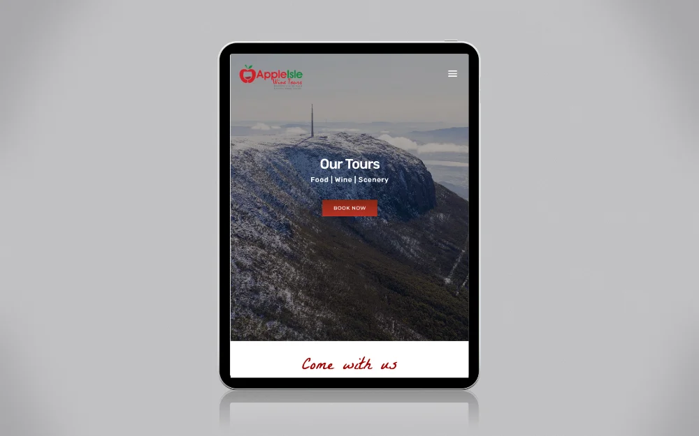
Tourism sites live or die on atmosphere. The photography was already there — Tasmanian wine country, mountains, vineyards, water — so the work was less about adding and more about getting out of the way. I rebuilt the layouts to lead with full-bleed imagery, gave each tour its own dedicated visual story, and stripped back the surrounding chrome so the scenery had room to breathe.
The brand cleanup was the next pass. Typography pulled into a tighter system that reads as Tasmanian-premium rather than generic-tourism. Brand colours restored to consistent values across CTAs, headers and section backgrounds, so the visual identity holds together page-to-page rather than drifting around.
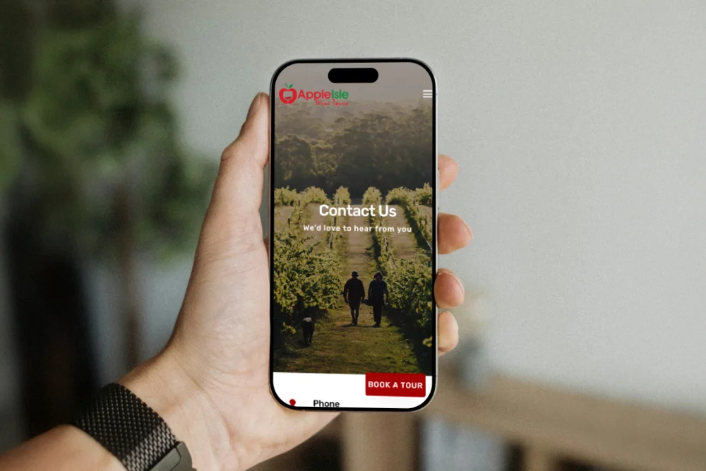
The integration was the practical lift. Each tour is wired directly into Justin’s FareHarbor account, so a visitor can browse a tour, see real-time availability, and book in there and then without bouncing out to a third-party platform. That’s the difference between an enquiry that converts in seconds and one that gets lost between browser tabs.
For SEO, the build targeted the terms his actual customers search — “wine tours Tasmania”, “private wine tour Hobart”, “Tamar Valley tour packages”, “Hobart airport transfers” — with dedicated landing pages so visitors arrive at something specific to their intent rather than a generic homepage.
The Outcome
Apple Isle now has a site that lets the scenery and the experience do the selling. Fonts and colours pulled into proper brand alignment, photography given the room it always deserved, and FareHarbor wired in so bookings happen in the moment rather than slipping through a contact form.
The site sells the tour before the visitor even has to think about it — and frees Justin up to focus on running the tours rather than managing the funnel.