The Brief
Karina runs Inspire Connections, an equine-facilitated learning practice based in Broadmarsh. She’d built her original site herself on Wix, and like a lot of DIY sites it had served its purpose in the early days but grown unwieldy over time — hard to update, inconsistent in places, and not really reflecting the quality of the work she was doing with kids, schools and NDIS participants.
She wanted something that put her best foot forward without losing the warmth of the practice itself.
Our Approach
The starting point was her logo. I pulled an earthy palette directly from it — warm, natural tones that match the bushland setting where the work actually happens. The idea was for the site to feel like an extension of the place rather than something imposed on top of it.
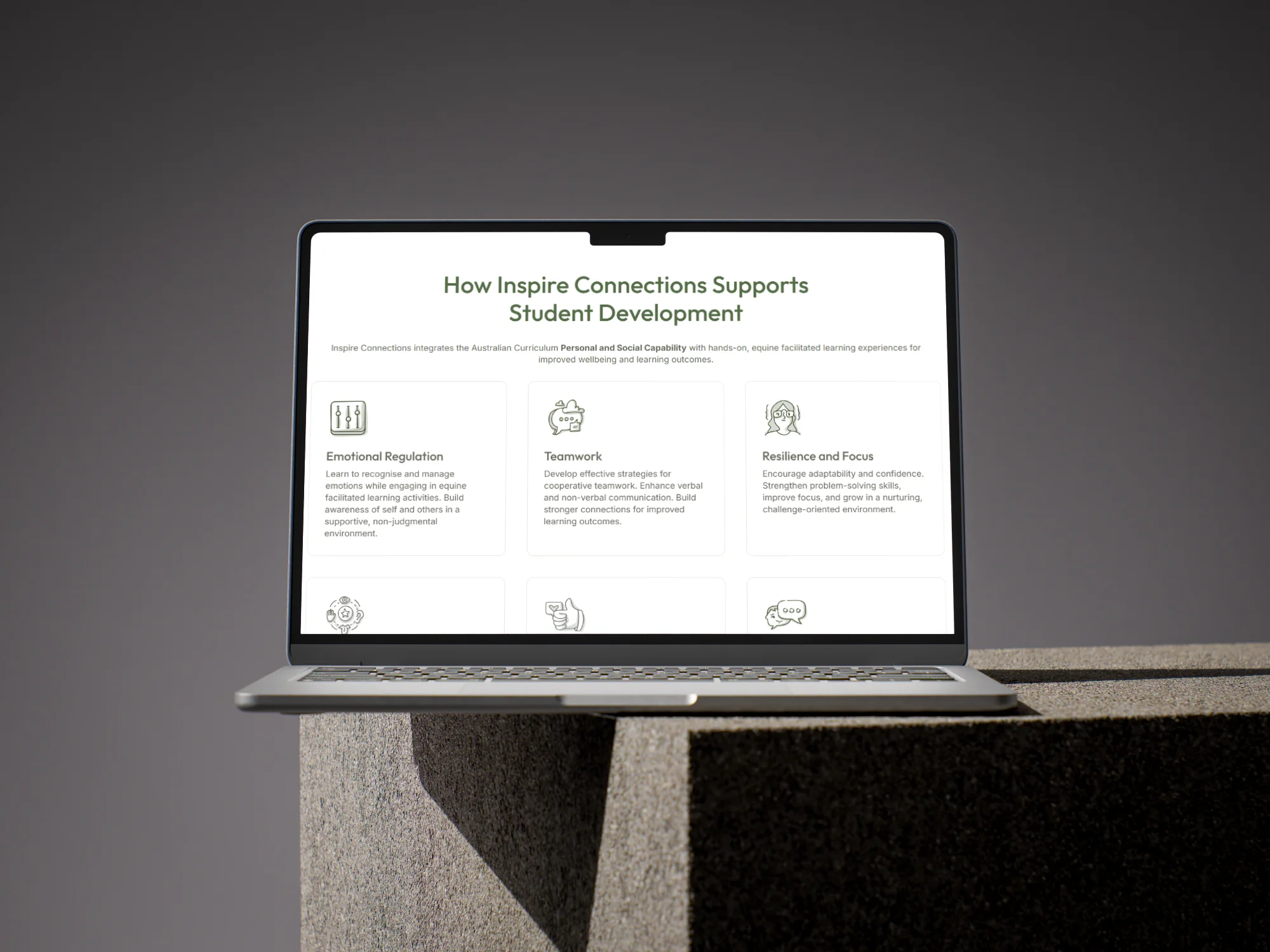
Because Karina works primarily with kids, I leaned into iconography with a soft, hand-drawn feel throughout the site. It’s a small detail, but it softens the tone in a way generic corporate-style icons never would, and it signals who the practice is really for without having to spell it out.
Six of the fourteen marks used through the site — one for each of the curriculum and wellbeing themes Karina works through, picked for their soft, hand-drawn feel so the tone matches who the practice is actually for.
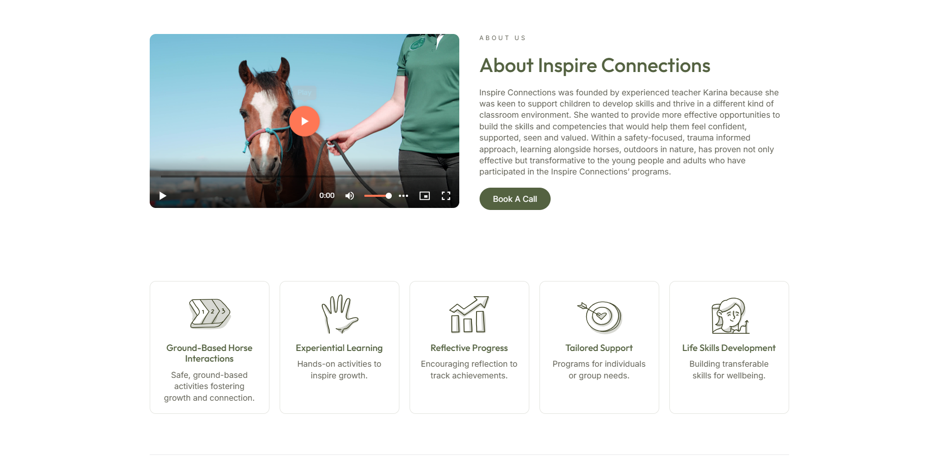
Two integrations did a lot of the practical heavy lifting. I set up Calendly so parents, educators and coordinators could book an introductory call directly, cutting out the back-and-forth email chain. And I embedded Karina’s introduction video on the homepage — it was already doing good work on other channels, and letting visitors meet her before they book builds trust faster than any amount of copy could.
The Outcome
The new site gives Inspire Connections a professional home that matches the quality of the work itself, without losing the calm, grounded feeling of the practice. Karina can update it confidently, visitors can book a call in a couple of clicks, and the whole thing looks like it belongs to the business it represents.